Monday, May 30, 2011

Exploring the Void

Local Toronto-based, Japanese-born illustrator Yuta Onoda, has some beautiful illustrations in his portfolio. He plays with proportion, animals as symbols and has a sense of space, or emptiness in his work, which I find appealing. His colour palette is restrained and lovely.


The Mask She Wears. Mixed media and digital.


Hope Leaves. Mixed media and digital.


Exploring the Void. Mixed media and digital.


Shadowed by Coyotes. Mixed media and digital.


The Tiger Mom. Mixed media and digital.

Check out his portfolio here and blog here.

Thursday, May 19, 2011

Haeckelesque & Codex

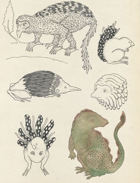
Several people (i.e. this is a what) have recently posted the wonderous illustrations of 
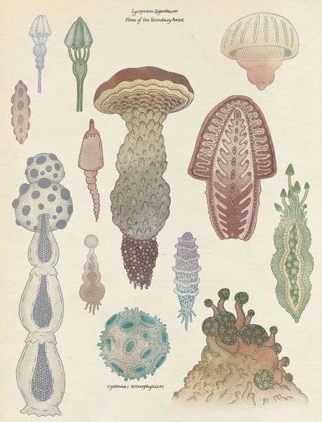
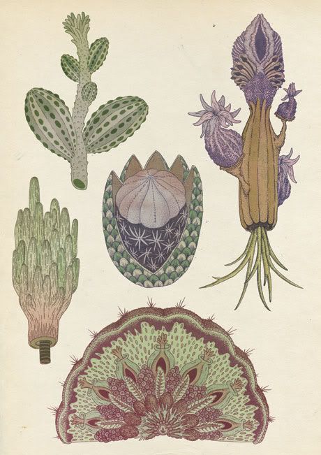
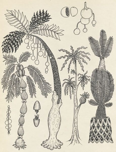
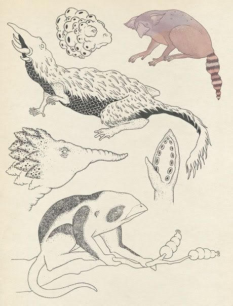
Katie Scott, but how could I resist? They remind me of course of botonical and zoological illustrations of Ernst Haeckel, with a modern, magical twist.
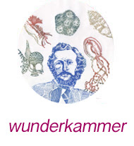
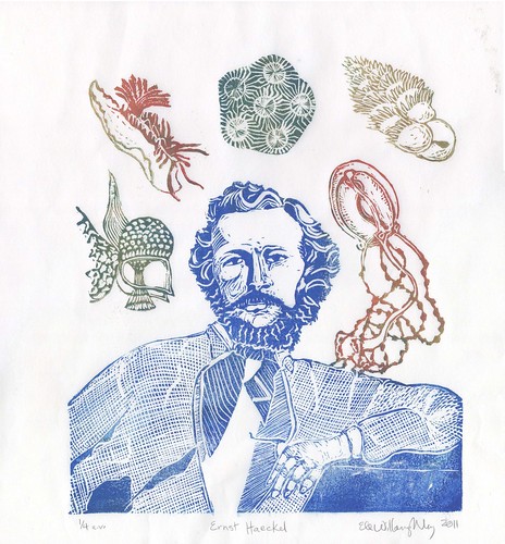


Ernst Haekel(February 16, 1834 – August 9, 1919), the famed German biologist, naturalist, philosopher, physician, professor and artist, whose book "Art Forms in Nature" filled with lovely 19th century scientific illustrations of biology has inspired many of my prints. I've had Haeckel on the brain even more than usual, having completed his portrait this week. So here we have the man himself, surrounded by several of the creatures he depicted. Clockwise from the top we have: rugosa, a foraminifer (or foram), a tubularid hydroid, homo sapiens (Ernst Haeckel), a dinoflagellate, and a sea slug or nudibranch.
Ernst Haeckel portrait

Katie Scott's familiar, yet imaginary creatures, also remind me of my favorite book which I've never seen in person*: the Codex Seraphinianus, written and illustrated by Italian architect Luigi Serafini from 1976 to 1978. It's a visual encyclopedia, of a foreign, paradoxical yet familiar, world, complete with its own language and obscure meanings.


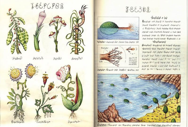
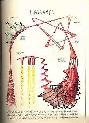
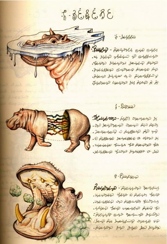
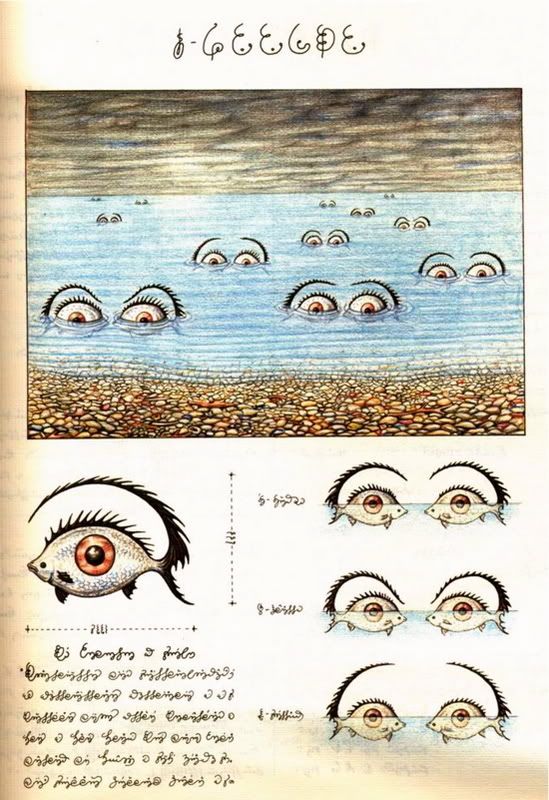
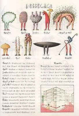
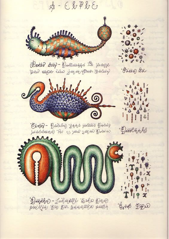
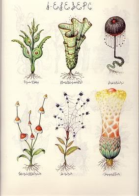
There's much more to this publication than I've shown, so do yourself a favour and check out this list 
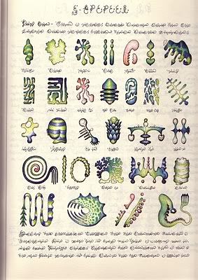
where it has been digitized in its surreal entirety! It has been compared to the Voynich Manuscript, a medieval manuscript in an undeciphered script (looks like a combination of roman characters and numbers) with illustrations of a seemingly scientific nature (botanical, astronomical or astrological, pharmaceutical) which has confused cryptologists and medievalists for decades.

*Hint to friends and loved ones: I need this book. Any edition is fine by me!

Wednesday, May 11, 2011

Sculpting Data and Painting Time Series

Nathalie Miebach employs real data - astronomical, ecological and meteorological - which she 'translates' into woven sculpture. She uses basket weaving to provide a grid for plotting data! She writes, "By staying true to the numbers, these woven pieces tread an uneasy divide between functioning both as sculptures in space as well as instruments that could be used in the actual environment from which the data originates." She's fascinated by scientific informatics and the role of aesthetics as well as the respective domains of art and science. She's also translated data into musical scores and collaborated with musicians. Some of her work involves her own data gathering.

Consider the following. (All text in italics is by Miebach).

Changing Water - Gulf of Maine
mixed media, data
(proto-type for a 20 foot long wall installation), 20’x10’ x 1’, 2011

This semi-kinetic piece looks at the interaction between meteorological conditions and marine environments in the Gulf of Maine.


Hurricane Noel
Ink, data
11”x17”, 2010

Using meteorological information from two weather stations (Hyannis, MA and Natashquan, Quebec) and one off shore buoy (George’s Bank), this score translates barometric, wind and temperature readings to try to discern the path Hurricane Noel took as it entered the Gulf of Maine during Nov 3-5, 2007. So far this score has been interpreted by “Butter”, a musical band from Provincetown, MA, and the Axis Ensemble, a new music group formed by composition graduate student from Tufts University.


“Changing Waters” looks at the meteorological and oceanic interactions within the Gulf of Maine. Using data from NOAA and GOMOSS buoys within the Gulf of Maine, as well as weather stations along the coast, I am translating data that explores the seasonal variations of marine life by looking at the interactions of atmospheric and marine data. Elements of the rich New England fishing history are also included. This large-scale installation consists of a large wall installation (33 feet wide) that plots information through the geographic anchors of a map of the Gulf of Maine, as well as a series of large, hanging structures (10 feet high) that look at more specific biological, chemical or geophysical relationships between marine ecosystems and weather patterns.

On display at the Fuller Craft Museum, Jan 15 – Sept 25, 2011. (www.fullercraft.org)


Antarctic Tidal Rhythms
Reed, wood, styrofoam, data, 8’ x 6’ x 3’, 2006

Using a base of 24 hours, this piece converts various layers of data (Jan-Dec 2005) related to the gravitational influence of both Sun and Moon on the Antarctic environment. The inner structure converts sunrise/set and moonrise/set data into the woven structure, with every weave representing one hour. Additional data translated include tide readings moon phases, solar noon readings and the molecular structure of ice.


Warm Winter
Reed, wood, data, 6’x 5’x6’, 2007

Using a base of 24 hours, this piece converts locally collected data (at Herring Cove) , with data from regional buoys (source: Gulf of Maine Observation System) and historical data (source: www.wunderground.com, NOAA and U.S. Naval Observatory). Data converted includes temperature (air, water, soil), wind speed and direction, tides and moon phases. The time frame translated is Dec 2006 – January 2007.


I've seen other artists who employ scientific data as a starting point for their art. But we can contrast what Miebach does with say, the paintings of Jonathan Zawada (below) in that she preserves the spatiotemporal relations of - and hence, if you know the mapping, the information encoded in - the data by literally 'plotting' in her basketwoven grid on on a musical score, rather than merely employing it as an aesthetic inspiration. (Toril Johannessen on the other hand, simply - and beautifully - plots data, just as any scientist would, but perhaps with a more panache, and allows the carefully selected time series speak for themselves). Further Miebach, by gathering her own data, combining it with public data sources and observing how for instance temperatures are affecting local flora and fauna, she is much more intimately tied the science, and her work is more informed by observation. I am tickled by the times series selected by Zawada and find his paintings pleasing, but I am awed by what Miebach does. I've quoted her directly so as to appear reasonable and avoid writing something uncouth like, "OMG this is the most amazing thing evar!"

Jonathan Zawada modelled 2D time series (somewhat regretably referred to "graph data" but that's really unlikely to annoy anyone unless, like me, they spend a lot of time doing time series analysis, so all non-scientists should simply ignore this digression) into 3D landscapes which he then painted in oil on canvas. Each canvas was presented behind a plinth with a mirror on which the original time series is printed.


Earth Movers, Oil on linen 39.37 x 75.59 inches 100 x 192 cm


photo showing Populations, Oil on linen 37.01 x 78.74 inches 94 x 200 cm


Flight 77, Oil on linen 59.06 x 46.06 inches149.9 x 117 cm (altitude versus time data)

LinkWithin

Related Posts with Thumbnails